- How to update plugin manually through FTP
- How to update UABB?
- How to register your license?
- About Beta Versions
- Will I lose all my design work when I download and re-install the plugin?
- Getting Started with the Ultimate Addons for Beaver Builder
- How can I install the Ultimate Addons for Beaver Builder?
- Automatic Beta Updates
- How to check expiration date of license?
- How to enable / disable Beaver Builder's UI?
- UABB Global Settings
- How to White Label UABB?
- How to enable / disable Live Preview feature?
- How to Hide Templates from your Clients?
- How can I use other modules in Modal Popup / Advanced Accordion / Advanced Tab?
- How to enable / disable modules in UABB to reduce server requests?
- Section and Page Templates don’t look the same when I am using them. Why?
- How can I Begin Building a Page using UABB?
- Introducing Table Module
- How To Add Rows And Columns to the Table?
- How to add Table Header?
- How to add Table Content?
- How to add Sortable and Searchable Table? How to Show Entries Dropdown?
- How to Merge Columns and Rows in Table?
- How to Style the Table?
- How to Override Global Settings for Image / Icon?
- Create Table by Uploading CSV
- Video Gallery Module
- How to Set Categories for Videos?
- How to Design Filterable Video Gallery?
- How to Display Specific Video Category Tab as a Default on Page Load?
- How to Set a Custom Placeholder Image for the Video?
- How to Set Overlay Color on the Video Thumbnail on Mouse Hover?
- How to Show Video Caption on Hover?
- How to Show Video Category on Hover?
- Open a Specific Filterable Tab from URL
- Equal height option of Advanced Post module isn't working properly?
- How to Exclude your Current Post from Advanced Post module?
- How to Enable Taxonomy Filters in Advanced Posts?
- How to filter Query Parameters in Advanced Posts?
- How to enable Pagination for Advanced Posts module
- UABB Advanced Posts Custom Posts Layout shortcodes and usage?
- Advanced Posts Pagination not visible?
- Regenerate Thumbnails
- Open a Specific Filterable Tab from URL for Advanced Post
- Building Site-wide Modal Popups in Beaver Builder & UABB
- How can I use the Modal Popup module effectively?
- Is it Possible to Close a Modal Popup on a Button Click or Text?
- How to open a modal popup from another module?
- How to trigger a Modal Popup on the click of a Menu Element?
- How to trigger a Modal Popup on the click of an Interactive Banner 2 and from a text of any module’s text editor?
- Woo – Products Module
- How to set Grid and Carousel layout for WooCommerce products?
- How to display exact WooCommerce product with Query Builder?
- How to Set Featured Products in WooCommerce?
- How to Enable Quick View for WooCommerce Products?
- How to Exclude WooCommerce Products with Woo-Products Module?
- Filters/Actions for WooCommerce Products
- Business Reviews module
- How to get Yelp API key?
- How to find Yelp Business ID?
- How to find Google Place ID?
- How does the Refresh Reviews option function in the Business Reviews module?
- Unable to display more than 5 Google reviews/3 Yelp Reviews?
- How many numbers of reviews can be shown for Google and Yelp?
- How to get Google Places API key?
- Introducing User Registration Form Module!
- How to Create a User Registration Form using Beaver Builder?
- How to Create a User Registration Form with Only Email Field in Beaver Builder?
- Frequently Asked Questions about User Registration Forms
- Honeypot field in User Registration Form for Beaver Builder
- Google reCAPTCHA v2 and v3 in Contact Form and User Registration Form for Beaver Builder
- Troubleshooting Tips for Ultimate Addon’s Font Icons
- White Screen / Blank Screen / 500 Error After Installation
- Fatal error: Call to undefined function array_replace_recursive()
- How to Increase the Memory Limit of your site?
- Fatal error: Class 'FLBuilderAdminSettings' not found
- Failed to download template from Template Cloud
- Haven't received update notification yet?
- cURL error 51: SSL: No alternative certificate subject name matches target host name
- DIY Troubleshooting
Introducing User Registration Form Module!
The User Registration Form module of Ultimate Addons for Beaver Builder helps you to create and design the perfect user registration forms on your website. You also have the option of redirecting the user to Custom URL, auto-login, and sending an email after successful registration using this module.
Here are the key features of the User Registration Form module –
- Option to Register only with the Email field
- Form Fields – Username, First Name, Last Name, Email, Password, Confirm Password
- Also provides Anti-Spam protection using Honeypot and reCAPTCHA feature
- Submit Button customizations
- Input field width option for all form fields
- Option to Hide/Show the Label fields
- Set the New User Role for User Registration Form module
- Redirect the user to a specific URL after a successful registration
- Auto-Login or Send Email option after a successful registration
- Provides Lost Your Password & Login Page options
- Provides Password Strength Checker option
- Success / Error message customizations
Below are the settings available for the User Registration Form module –
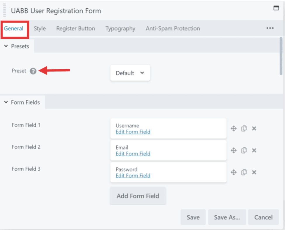
Presets
While working with UABB modules, you can simply choose any style from a list of professionally designed, sleek, and classic presets. Presets will help you quickly create great designs. You can select the preset of your choice here. But before changing presets, save the content, you added to the module. Otherwise, your content will be overwritten with the default one.
Form Fields
The first tab which is the General tab of the User Registration Form module will provide you with the options to choose the User Registration Form fields. Here only by providing the Email field, you can register users to your site if required.
Other than the Email field you have the options to add Username, First Name, Last Name, Password, and Confirm Password to your Registration Form.
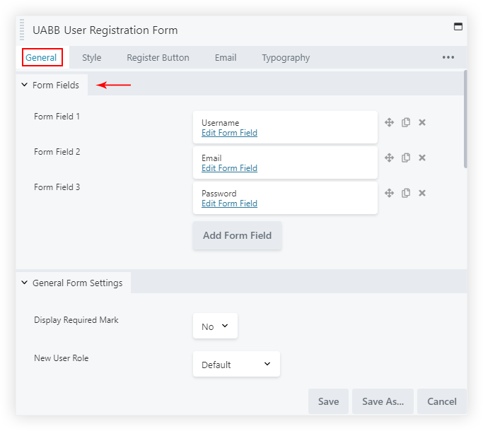
Another important feature we provide is the Honeypot form field, this provides an added level of security to your user registration forms from the spammers and bots. Just add the Honeypot form field and it is done. Simple, right?
You will also be able to set a size for the Form fields from extra small to extra large based on your requirements. And you will find the Required Mark option which can be enabled to add asterisk mark from here to the labels on the form.
After Register Actions
Under the General Tab, you will see After Register Actions section under which you will find various after Registration options like Redirect, Auto-Login, Send Email –
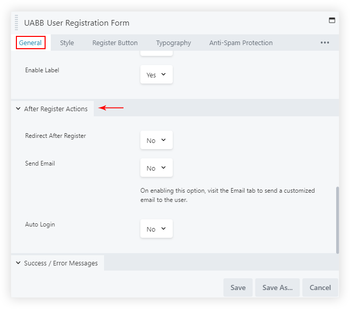
Following are the above-mentioned options with a detailed description –
Redirect After Register: After the user enters his/her details for registration he/she can be redirected to a custom URL.
Auto-Login: On Enabling this option the user after successful registration will be automatically logged in to the site without requiring to log in again.
Send Email: On enabling this option the User after Successful registration can be sent an Email about their registration on your website.
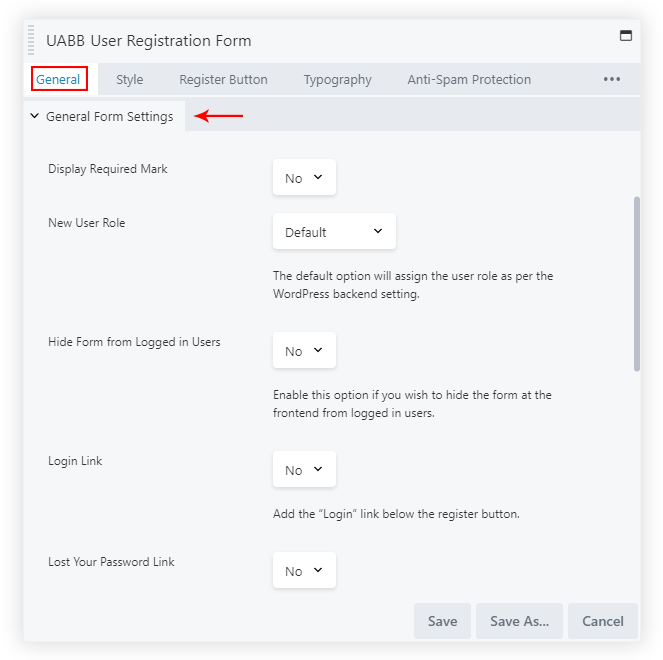
General Settings
You will find the options to display the fields below the form like – Lost your Password, Login, Password Strength Checker and options to disable all the label fields at once.
Also, the option to set the New User Role or by default it would assign the User role as per the WordPress backend setting.
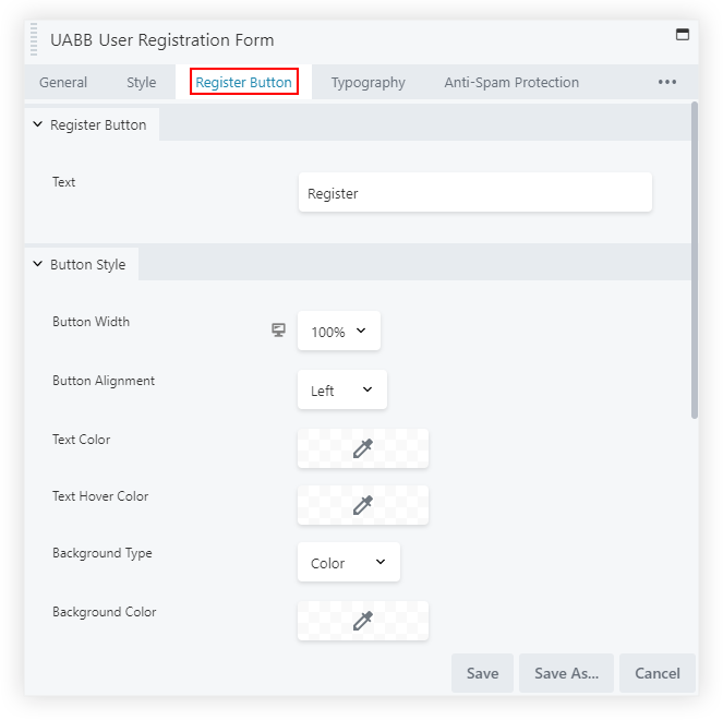
Register Button
Under the Register Button tab, you will be able to Customize the Register Button as per your requirements. You can edit the text of the Register Button, set the Size, Alignment, Width and also add an Icon with its positioning before and after the text along with the Icon Spacing between the text.
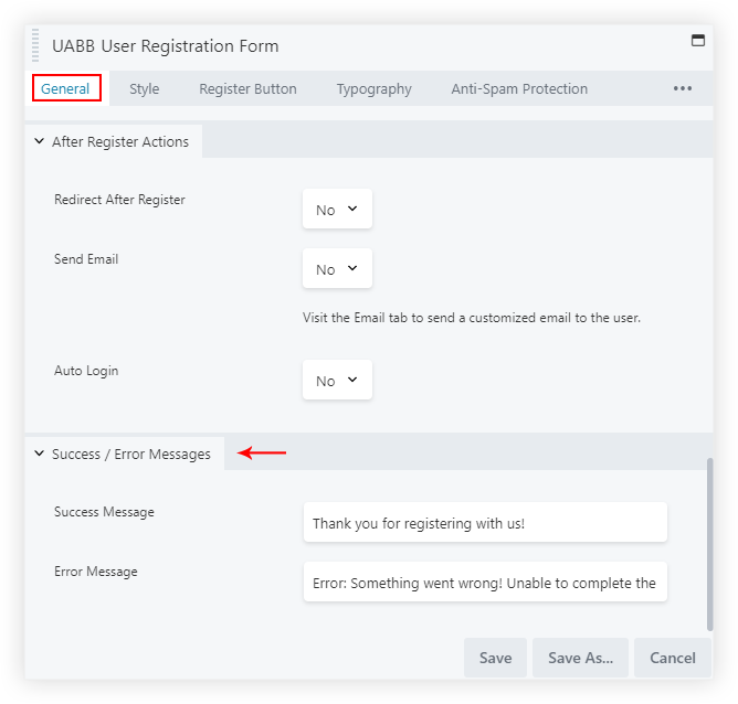
Success and Error Messages
You have the option to change the Success and Error Messages under the General Tab > Success / Error Messages section –
Style the User Registration Form
Under the Style tab, we have different sections like –
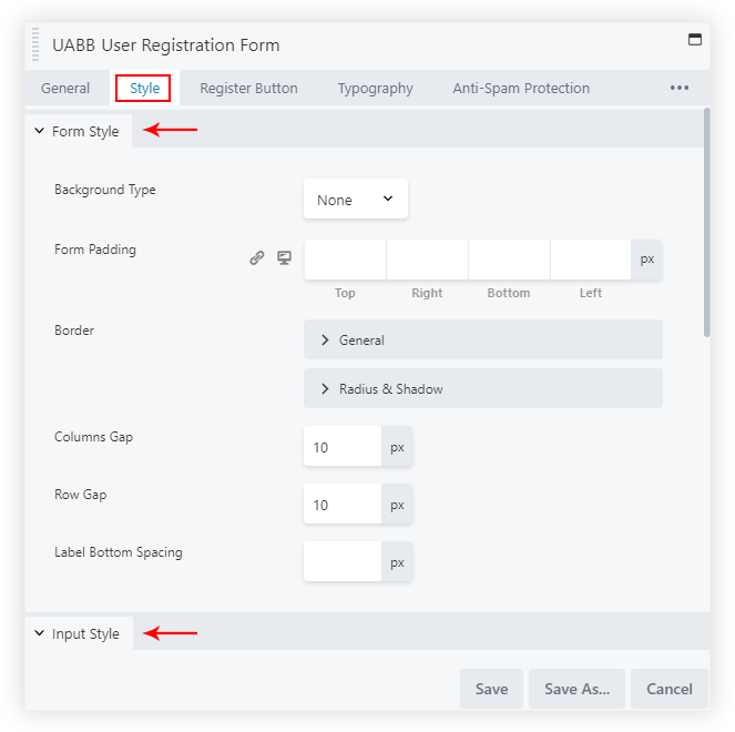
Form Style section: You can set the Background type like Color, Gradient or None by default. Manage the Padding, Border, Columns Gap, Rows Gap, etc. of the Form.
Input Style section: From here you can manage the Padding, Background color, Border, and Border Active Color.
Validation section: Set the Color, Border styling, and Padding for the Success Field Validation and Error Field Validation.
We don't respond to the article feedback, we use it to improve our support content.