
- How to update plugin manually through FTP
- How to update UABB?
- How to register your license?
- About Beta Versions
- Will I lose all my design work when I download and re-install the plugin?
- Getting Started with the Ultimate Addons for Beaver Builder
- How can I install the Ultimate Addons for Beaver Builder?
- Automatic Beta Updates
- How to check expiration date of license?
- How to enable / disable Beaver Builder's UI?
- UABB Global Settings
- How to White Label UABB?
- How to enable / disable Live Preview feature?
- How to Hide Templates from your Clients?
- How can I use other modules in Modal Popup / Advanced Accordion / Advanced Tab?
- How to enable / disable modules in UABB to reduce server requests?
- Section and Page Templates don’t look the same when I am using them. Why?
- How can I Begin Building a Page using UABB?
- Introducing Table Module
- How To Add Rows And Columns to the Table?
- How to add Table Header?
- How to add Table Content?
- How to add Sortable and Searchable Table? How to Show Entries Dropdown?
- How to Merge Columns and Rows in Table?
- How to Style the Table?
- How to Override Global Settings for Image / Icon?
- Create Table by Uploading CSV
- Video Gallery Module
- How to Set Categories for Videos?
- How to Design Filterable Video Gallery?
- How to Display Specific Video Category Tab as a Default on Page Load?
- How to Set a Custom Placeholder Image for the Video?
- How to Set Overlay Color on the Video Thumbnail on Mouse Hover?
- How to Show Video Caption on Hover?
- How to Show Video Category on Hover?
- Open a Specific Filterable Tab from URL
- Equal height option of Advanced Post module isn't working properly?
- How to Exclude your Current Post from Advanced Post module?
- How to Enable Taxonomy Filters in Advanced Posts?
- How to filter Query Parameters in Advanced Posts?
- How to enable Pagination for Advanced Posts module
- UABB Advanced Posts Custom Posts Layout shortcodes and usage?
- Advanced Posts Pagination not visible?
- Regenerate Thumbnails
- Open a Specific Filterable Tab from URL for Advanced Post
- Building Site-wide Modal Popups in Beaver Builder & UABB
- How can I use the Modal Popup module effectively?
- Is it Possible to Close a Modal Popup on a Button Click or Text?
- How to open a modal popup from another module?
- How to trigger a Modal Popup on the click of a Menu Element?
- How to trigger a Modal Popup on the click of an Interactive Banner 2 and from a text of any module’s text editor?
- Woo – Products Module
- How to set Grid and Carousel layout for WooCommerce products?
- How to display exact WooCommerce product with Query Builder?
- How to Set Featured Products in WooCommerce?
- How to Enable Quick View for WooCommerce Products?
- How to Exclude WooCommerce Products with Woo-Products Module?
- Filters/Actions for WooCommerce Products
- Business Reviews module
- How to get Yelp API key?
- How to find Yelp Business ID?
- How to find Google Place ID?
- How does the Refresh Reviews option function in the Business Reviews module?
- Unable to display more than 5 Google reviews/3 Yelp Reviews?
- How many numbers of reviews can be shown for Google and Yelp?
- How to get Google Places API key?
- Introducing User Registration Form Module!
- How to Create a User Registration Form using Beaver Builder?
- How to Create a User Registration Form with Only Email Field in Beaver Builder?
- Frequently Asked Questions about User Registration Forms
- Honeypot field in User Registration Form for Beaver Builder
- Google reCAPTCHA v2 and v3 in Contact Form and User Registration Form for Beaver Builder
- Troubleshooting Tips for Ultimate Addon’s Font Icons
- White Screen / Blank Screen / 500 Error After Installation
- Fatal error: Call to undefined function array_replace_recursive()
- How to Increase the Memory Limit of your site?
- Fatal error: Class 'FLBuilderAdminSettings' not found
- Failed to download template from Template Cloud
- Haven't received update notification yet?
- cURL error 51: SSL: No alternative certificate subject name matches target host name
- DIY Troubleshooting
UABB Subscription Form
Ultimate Addon for Beaver Builder plugin comes with the feature of adding a beautiful subscription form to your website. This document will explain how you can add this form to your website and how to customize it. Let’s get started!
Getting Started
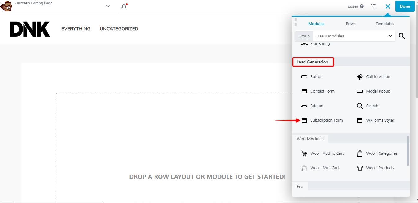
To start, create a new page and edit it with Beaver Builder. You will need to click on the “+” symbol on the top right corner of the page to add the subscription form. Click on the drop-down menu and select UABB modules.
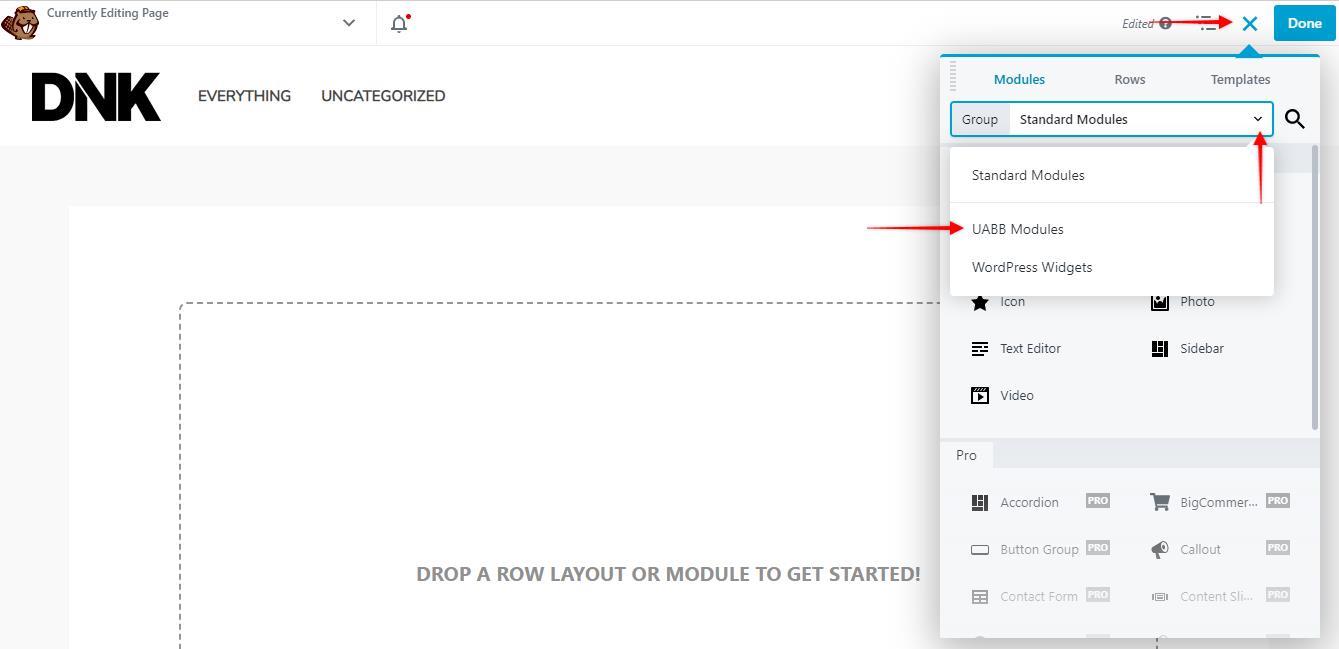
Adding the form to your page
Once you select the UABB modules, scroll down to the Lead Generation section where you will be able to locate the subscription form. Drag and drop the form onto your page.
General Settings
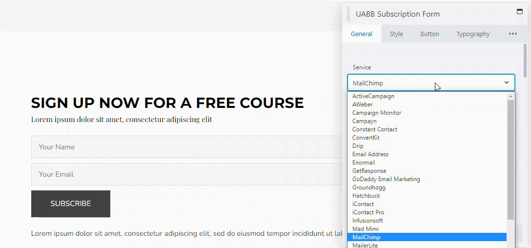
Integration
You can integrate the subscription form into almost all the common WordPress email tools such as MailChimp, Active Campaign, etc, or simply integrate it into your email address. Select the options that you would like to choose from the drop-down and enter the details and click on connect. In this example, we will integrate the form into the email address.
Designing the heading
In the next step, you will need to choose the heading text and the description text of your form. Scroll down to the heading section, simply click on the boxes and edit the text.
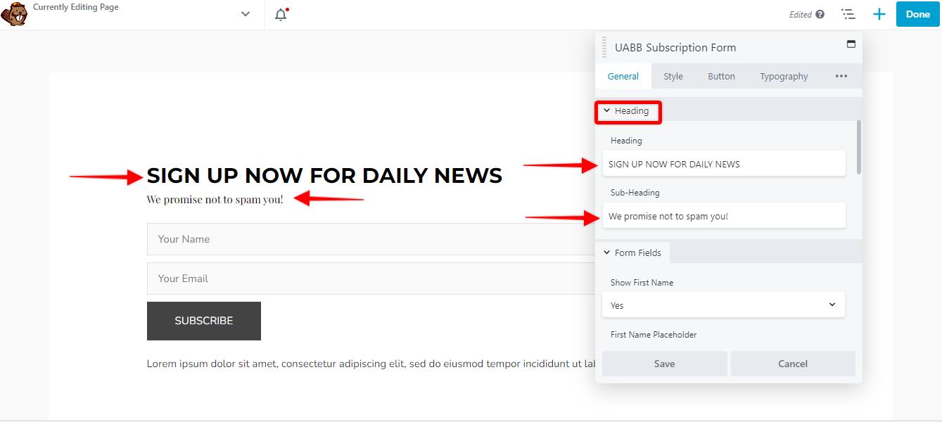
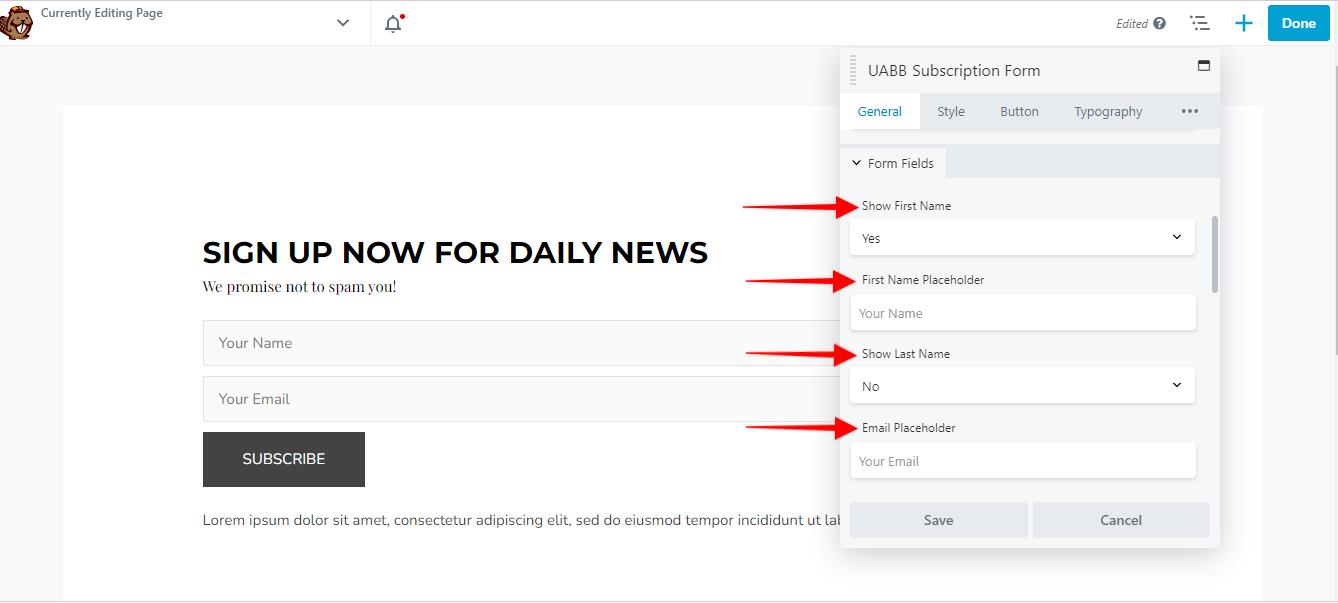
Form Fields
Form fields let you choose the fields inside the subscription form. By default you will see the following fields:
- Show First Name
- Show Last Name
- Email Placeholder
You can choose to turn on or off the first two options. You can also choose a placeholder for these fields as well.
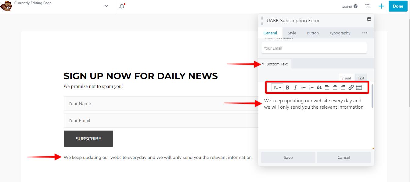
Bottom Text
The bottom text option lets you add a paragraph at the bottom of your subscription form to let your users know what information they will receive by subscribing to your website’s newsletter. If you would like to edit the text or change the fonts, feel free to use the design tab.
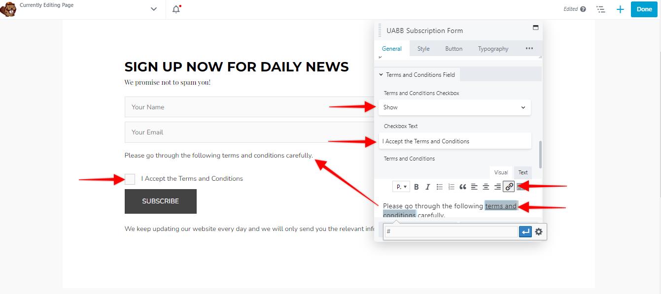
Terms and conditions field
Using this field, you can add a checkbox for your users to accept the terms and conditions of your website. You can edit the text that appears next to the checkbox simply by clicking on the checkbox text field. You can also link your Terms and Conditions page by highlighting the text and clicking on the link button inside the terms and conditions field.
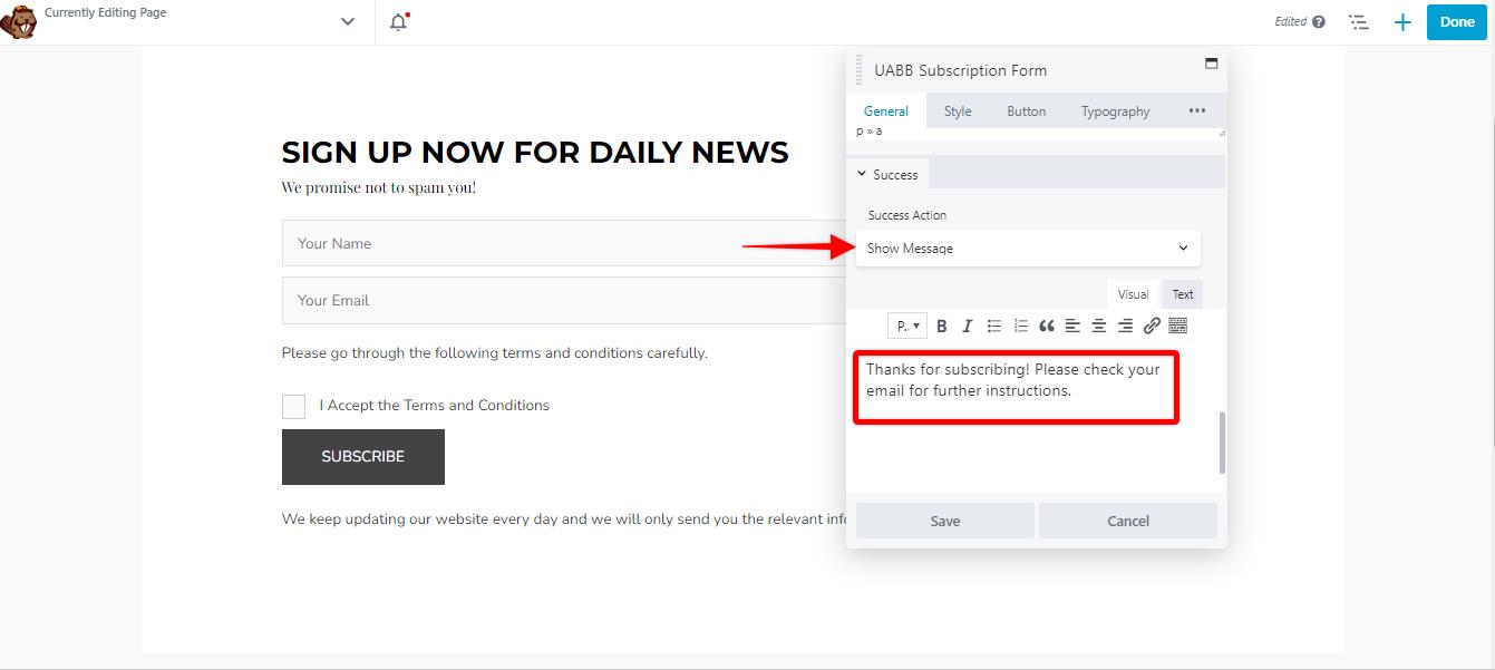
Success Action
Once the user clicks on the Subscribe button after entering their details, you can either show a message or redirect them to a particular page. If you would like to redirect the users to a particular page after they hit the subscription button, simply click on the drop-down under success action and choose redirect. You will need to enter the URL of the webpage that you would like to redirect them to.
Style Settings
Alignment
Overall Alignment: Overall alignment option lets you choose the alignment of the form elements on your website. You can choose from left, right, or center alignment options.
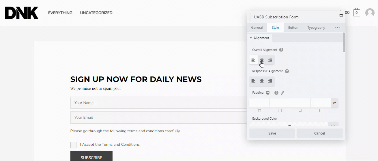
Responsive Alignment: Responsive alignment lets you choose how this form will be aligned on a mobile device. Similarly, you can either choose left, right or center alignment.
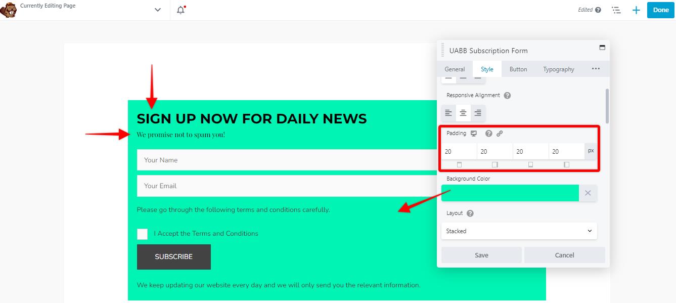
Padding: The padding option lets you apply padding around the form.
Background Color: You can add a background color to your form using this option.
Layout: This option allows you to choose how your form appears on mobile devices. You can either choose from stacked or inline as per your preference.
Form Input Style
Spacing: This option allows you to increase or decrease the spacing between the form elements. Simply drag the slider or enter the number of pixels that you would like to add between the elements of the form.
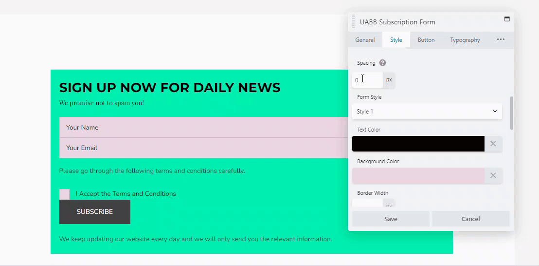
Form Style: By default, there are two forms styles that are available within the UABB subscription form. You can choose either of them by clicking on the drop-down menu.
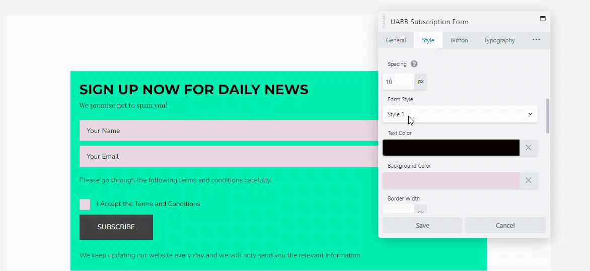
Text color and the background color: These two options add flexibility to the design of the placeholders of your form. Changing the text color not only changes the color of the placeholder texts but also changes the user input text color. You can use the background color to change the color of the placeholder box’s background.
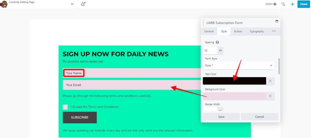
Border Design: This option lets you design the border around the placeholders and also around the checkbox. You can add a border width, and change the border color. You can also add a special border color when a form field is active.
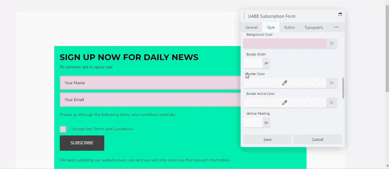
Vertical and horizontal padding: These two options let you choose the padding inside the form elements. You can simply drag the slider or enter the number of pixels that you would like to keep the space between the two elements.
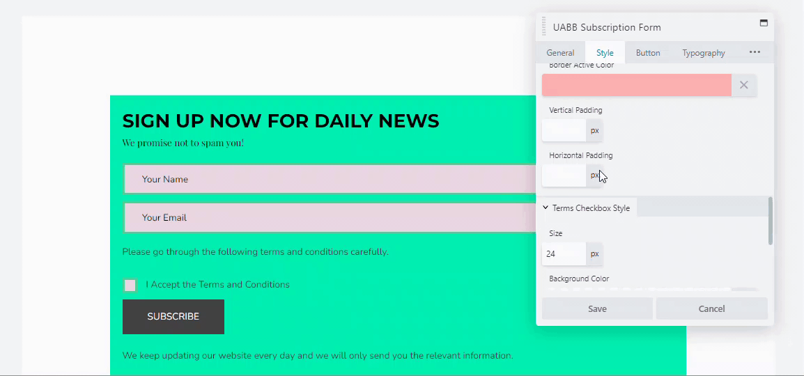
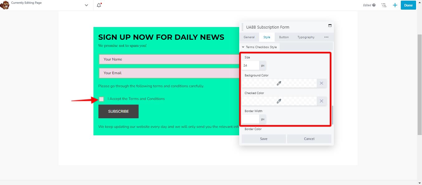
Terms Checkbox Style:
You can style your checkbox to accept the terms and conditions by using this option. You can make the following style changes to the checkbox:
Size: You can change the size of the checkbox using this option.
Background Color: Let you choose the background color of the checkbox.
Checked Color: You can change the color of the checkbox once your customer checks it using this option.
Border Width and Border Color: You can set the border width and the border color of the checkbox using these options.
Checkbox Round Corner: You can make the corner of the checkbox round by entering a number in this field.
Button
The button tab lets you customize the Subscribe button on your form. Here are a few options that you can use to customize your subscribe button.
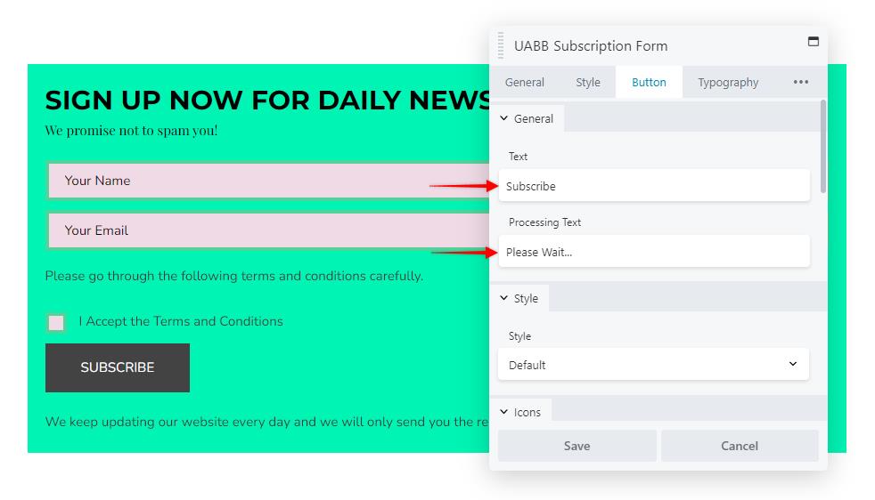
General
Button Text: You can change the text of your button by editing the text field.
Processing Text: This option allows you to change the text that your users see once they click on the button. You can also edit this simply by clicking on the text.
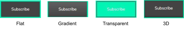
Style
There are 5 different styles that you can choose from while customizing your button. Once you add the form, the default style will be added automatically. You can change it to the following style options.
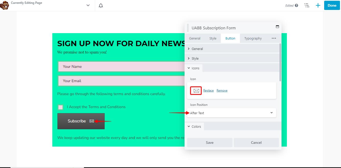
Icons
You can also add an icon to your button using this option. There are thousands of icons that you can choose from. You also have the option to place the icon before or after the button text.
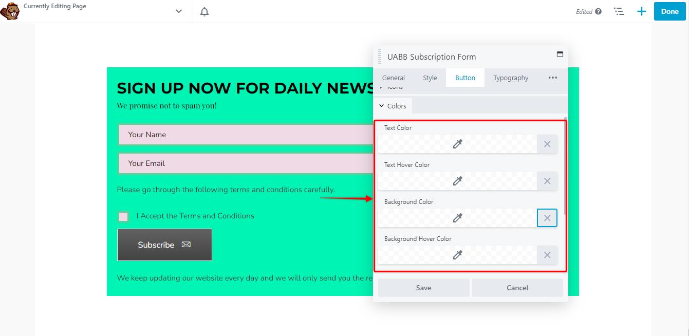
Colors
You can change the look of the subscribe button using various color options such as
Text Color: This lets you choose the color of the text on the buttons.
Text Hover Color: Let you choose the color of the text on the buttons when being hovered over.
Background Color: Let you choose the background color of the text
Background Hover Color: Let you choose the background color of the text when being hovered over.
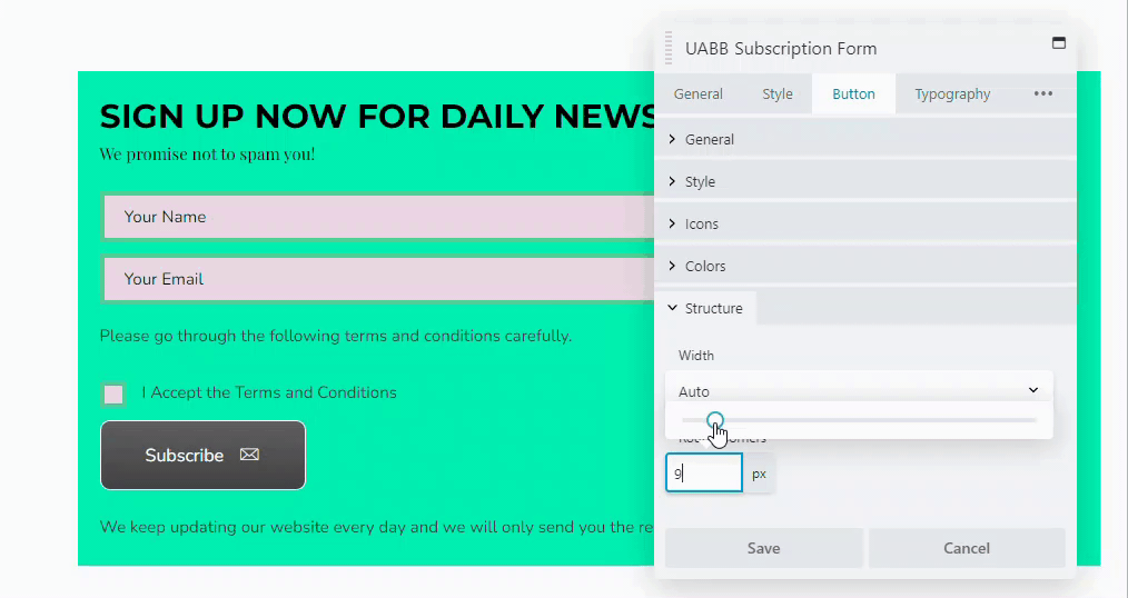
Structure
You can also change the overall structure of the button by changing the width of the button and adding rounded corners using the structure option.
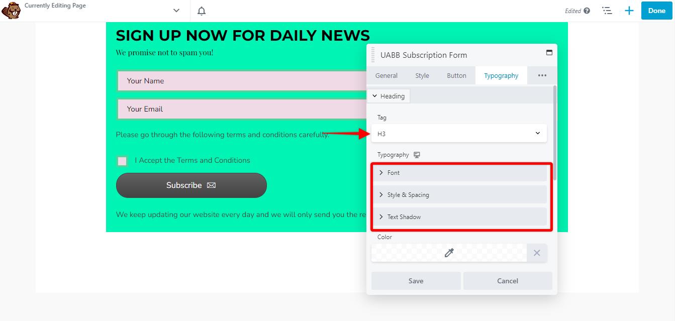
Typography
You can change the font. Heading tag, style and spacing, and text-shadow for each text that you have inserted on your form.
We don't respond to the article feedback, we use it to improve our support content.