
- How to update plugin manually through FTP
- How to update UABB?
- How to register your license?
- About Beta Versions
- Will I lose all my design work when I download and re-install the plugin?
- Getting Started with the Ultimate Addons for Beaver Builder
- How can I install the Ultimate Addons for Beaver Builder?
- Automatic Beta Updates
- How to check expiration date of license?
- How to enable / disable Beaver Builder's UI?
- UABB Global Settings
- How to White Label UABB?
- How to enable / disable Live Preview feature?
- How to Hide Templates from your Clients?
- How can I use other modules in Modal Popup / Advanced Accordion / Advanced Tab?
- How to enable / disable modules in UABB to reduce server requests?
- Section and Page Templates don’t look the same when I am using them. Why?
- How can I Begin Building a Page using UABB?
- Video Gallery Module
- How to Set Categories for Videos?
- How to Design Filterable Video Gallery?
- How to Display Specific Video Category Tab as a Default on Page Load?
- How to Set a Custom Placeholder Image for the Video?
- How to Set Overlay Color on the Video Thumbnail on Mouse Hover?
- How to Show Video Caption on Hover?
- How to Show Video Category on Hover?
- Open a Specific Filterable Tab from URL
- Introducing Table Module
- How To Add Rows And Columns to the Table?
- How to add Table Header?
- How to add Table Content?
- How to add Sortable and Searchable Table? How to Show Entries Dropdown?
- How to Merge Columns and Rows in Table?
- How to Style the Table?
- How to Override Global Settings for Image / Icon?
- Create Table by Uploading CSV
- Equal height option of Advanced Post module isn't working properly?
- How to Exclude your Current Post from Advanced Post module?
- How to Enable Taxonomy Filters in Advanced Posts?
- How to filter Query Parameters in Advanced Posts?
- How to enable Pagination for Advanced Posts module
- UABB Advanced Posts Custom Posts Layout shortcodes and usage?
- Advanced Posts Pagination not visible?
- Regenerate Thumbnails
- Open a Specific Filterable Tab from URL for Advanced Post
- Building Site-wide Modal Popups in Beaver Builder & UABB
- How can I use the Modal Popup module effectively?
- Is it Possible to Close a Modal Popup on a Button Click or Text?
- How to open a modal popup from another module?
- How to trigger a Modal Popup on the click of a Menu Element?
- How to trigger a Modal Popup on the click of an Interactive Banner 2 and from a text of any module’s text editor?
- Woo – Products Module
- How to set Grid and Carousel layout for WooCommerce products?
- How to display exact WooCommerce product with Query Builder?
- How to Set Featured Products in WooCommerce?
- How to Enable Quick View for WooCommerce Products?
- How to Exclude WooCommerce Products with Woo-Products Module?
- Filters/Actions for WooCommerce Products
- Business Reviews module
- How to get Yelp API key?
- How to find Yelp Business ID?
- How to find Google Place ID?
- How does the Refresh Reviews option function in the Business Reviews module?
- Unable to display more than 5 Google reviews/3 Yelp Reviews?
- How many numbers of reviews can be shown for Google and Yelp?
- How to get Google Places API key?
- Introducing User Registration Form Module!
- How to Create a User Registration Form using Beaver Builder?
- How to Create a User Registration Form with Only Email Field in Beaver Builder?
- Frequently Asked Questions about User Registration Forms
- Honeypot field in User Registration Form for Beaver Builder
- Google reCAPTCHA v2 and v3 in Contact Form and User Registration Form for Beaver Builder
- Troubleshooting Tips for Ultimate Addon’s Font Icons
- White Screen / Blank Screen / 500 Error After Installation
- Fatal error: Call to undefined function array_replace_recursive()
- How to Increase the Memory Limit of your site?
- Fatal error: Class 'FLBuilderAdminSettings' not found
- Failed to download template from Template Cloud
- Haven't received update notification yet?
- cURL error 51: SSL: No alternative certificate subject name matches target host name
- DIY Troubleshooting
Introducing: Content Toggle Module
Available from version 1.8.0
Content Toggle module helps you display two versions of a content, saved row, saved module and saved page templates within a single section allowing users to toggle between them using the toggle button.
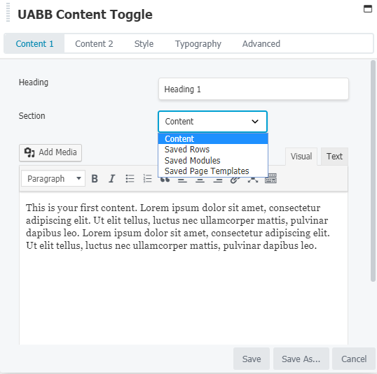
Content 1 Tab:
You can add the Heading title, content or you can change the section as saved row, saved templates or saved modules you can use Saved Row, Saved Modules, Page Templates created before.
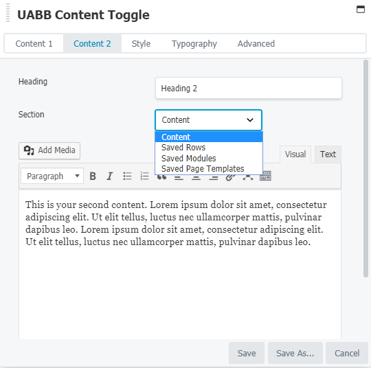
Content 2 Tab:
Like the content 1 tab, here too you can add the content you need.
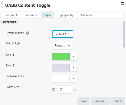
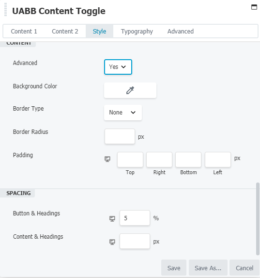
Style Tab:
You can choose which content you wish to display by default. You can change the switcher style( Round 1, Round 2, Rectangle, Label Box ). You can change the size, colors for switcher and controller.
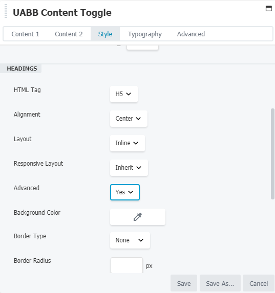
Heading tag will allow you to add HTML tags, Alignments, Layout, Background Color, Border Radius, Padding for heading.
Using the Content Tab you can add the Background Color, Border Radius, Padding for content. You can also add spacing between headings and buttons and in content and headings.
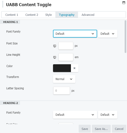
Typography Tab
Using this tab you can change the Heading 1, Heading 2, Content 1 and Content 2 typography like Font Family, Font Size, Line Height, Color, Text Transform, and Letter Spacing.
We don't respond to the article feedback, we use it to improve our support content.